Here we visually compare interactiveeafplots package output for Plotly and ggplot to the output of the package mooplot for EAF plots, EAF difference plots and symdev plots.
Comparisons to eafplot
# mooplot's eafplot
eafplot(x=mydata, percentiles=c(0,50,100), col=c("yellow","red"),
        maximise=FALSE, type="area", legend.pos="right", axes=TRUE,
        sci.notation=FALSE, xlab="MIN X", ylab="MIN Y")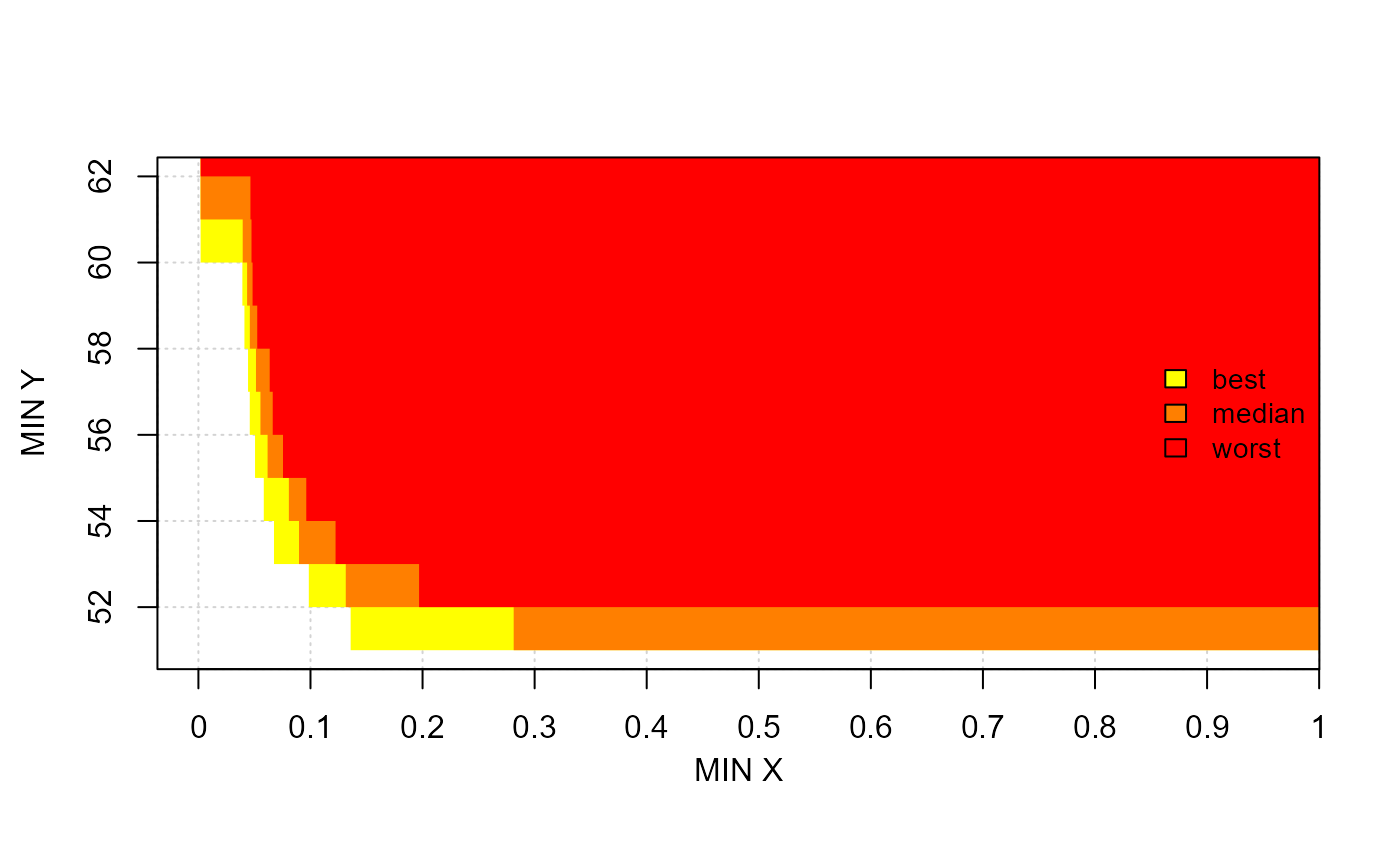
# interactiveeafplots' ggplot
interactiveeafplot(x=mydata, percentiles=c(0,50,100), col=c("yellow","red"),
                   maximise=FALSE, type="area", legend.pos="right",
                   axes=TRUE, sci.notation=FALSE, xlabel="MIN X",
                   ylabel="MIN Y", plot="ggplot")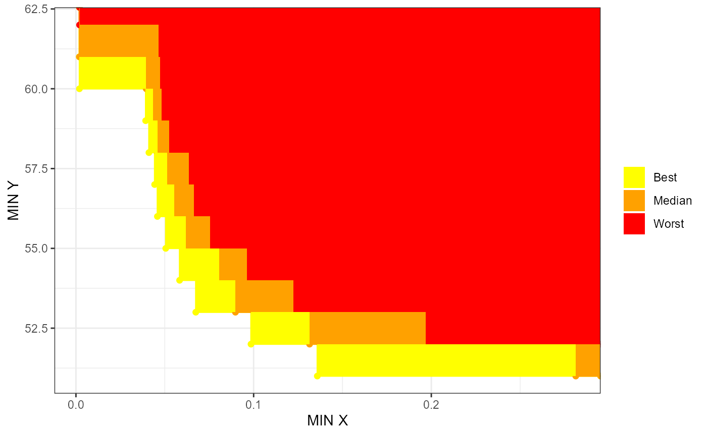
# interactiveeafplots' plotly
interactiveeafplot(x=mydata, percentiles=c(0,50,100), col=c("yellow","red"),
                   maximise=FALSE, type="area", legend.pos="right",
                   axes=TRUE, sci.notation=FALSE, xlabel="MIN X",
                   ylabel="MIN Y", plot="plotly")
Comparisons to eafdiffplot
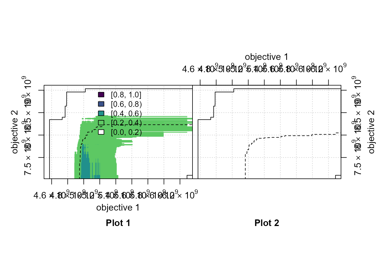
# mooplot's eafplot
if (requireNamespace("viridisLite", quietly=TRUE)) {
  viridis_r <- function(n) viridisLite::viridis(n, direction=-1)
  eafdiffplot(data_left=A1, data_right=A2, maximise = c(FALSE,TRUE),
                         type = "area", legend.pos = "top",
                         title_left="Plot 1", title_right="Plot 2",
                         sci.notation = TRUE, grand.lines=TRUE,
                         full.eaf=FALSE,intervals = 5L,col = viridis_r)
}
# interactiveeafplots' ggplot
if (requireNamespace("viridisLite", quietly=TRUE)) {
  viridis_r <- function(n) viridisLite::viridis(n, direction=-1)
  interactiveeafdiffplot(data_left=A1, data_right=A2,
                         maximise = c(FALSE,TRUE), type = "area",
                         legend.pos = "top",psize = 1,
                         xlabel = "Objective 1", ylabel = "Objective 2",
                         title_left="Plot 1", title_right="Plot 2",
                         sci.notation = TRUE, grand.lines=TRUE,
                         plot = "ggplot", full.eaf=FALSE,
                         intervals = 5, col = viridis_r(5))
}
#> Scale for y is already present.
#> Adding another scale for y, which will replace the existing scale.
#> Scale for y is already present.
#> Adding another scale for y, which will replace the existing scale.
#> Scale for x is already present.
#> Adding another scale for x, which will replace the existing scale.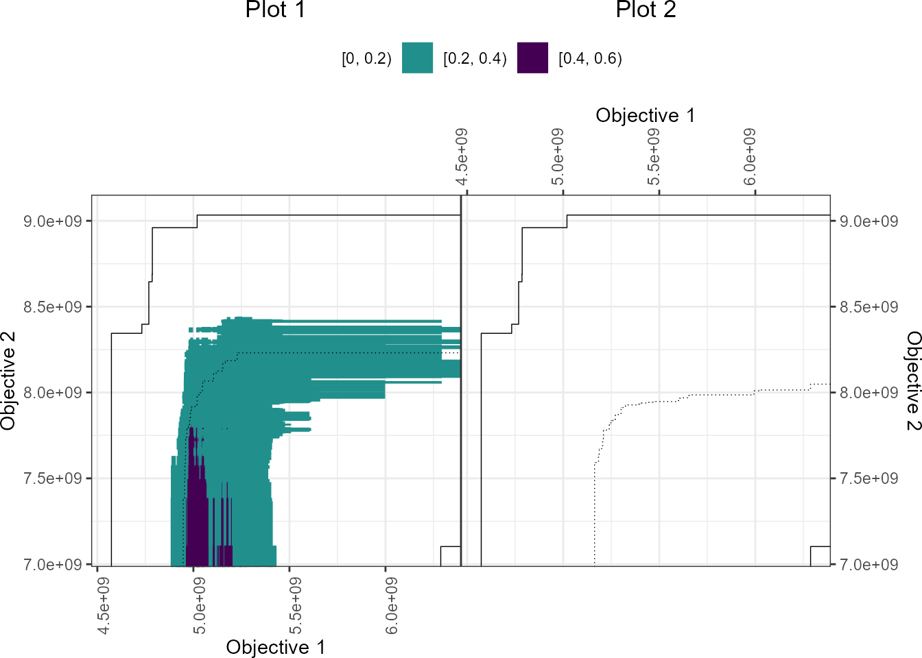
# interactiveeafplots' plotly
if (requireNamespace("viridisLite", quietly=TRUE)) {
  viridis_r <- function(n) viridisLite::viridis(n, direction=-1)
  interactiveeafdiffplot(data_left=A1, data_right=A2,
                         maximise = c(FALSE,TRUE), type = "area",
                         legend.pos = "top",psize = 1,
                         xlabel = "Objective 1", ylabel = "Objective 2",
                         title_left="Plot 1", title_right="Plot 2",
                         sci.notation = TRUE, grand.lines=TRUE,
                         plot = "plotly", full.eaf=FALSE,
                         intervals = 5, col = viridis_r(5))
}
#> Scale for y is already present.
#> Adding another scale for y, which will replace the existing scale.
#> Scale for y is already present.
#> Adding another scale for y, which will replace the existing scale.
Comparisons to symdevplot
# mooplot's eafplot
eafplot(CPFs[,1:2], sets = CPFs[,3], percentiles = c(0, 20, 40, 60, 80, 100),
        col =c("red","yellow"), type = "area",
        legend.pos = "bottomleft", extra.points = res$VE, extra.col = "cyan",
        extra.legend = "VE", extra.lty = "solid", extra.pch = NA, extra.lwd = 2,
        main = substitute(paste("Empirical attainment function, ",beta,"* = ", a, "%"),
                          list(a = formatC(res$threshold, digits = 2, format = "f"))))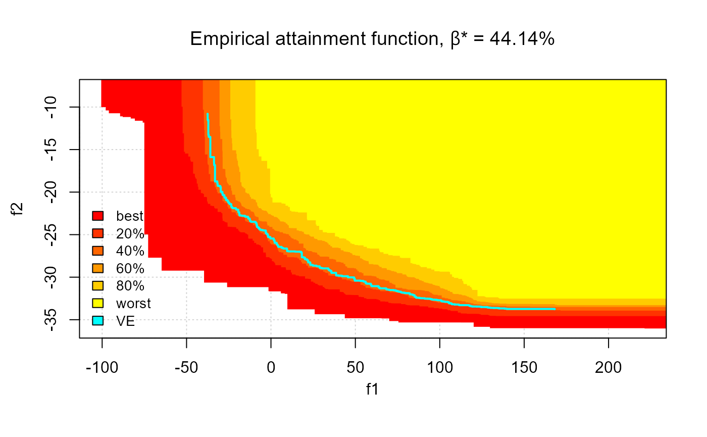
# interactiveeafplots' ggplot
interactivesymdevplot(x=CPFs, threshold=res$threshold, col =c("red","yellow"),
                      percentiles = c(0,20,40,60,80,100), type="area",
                      thrcol="cyan", plot = "ggplot", extraLegend="VE",
                      sci.notation = TRUE, legend.pos = "bottomleft")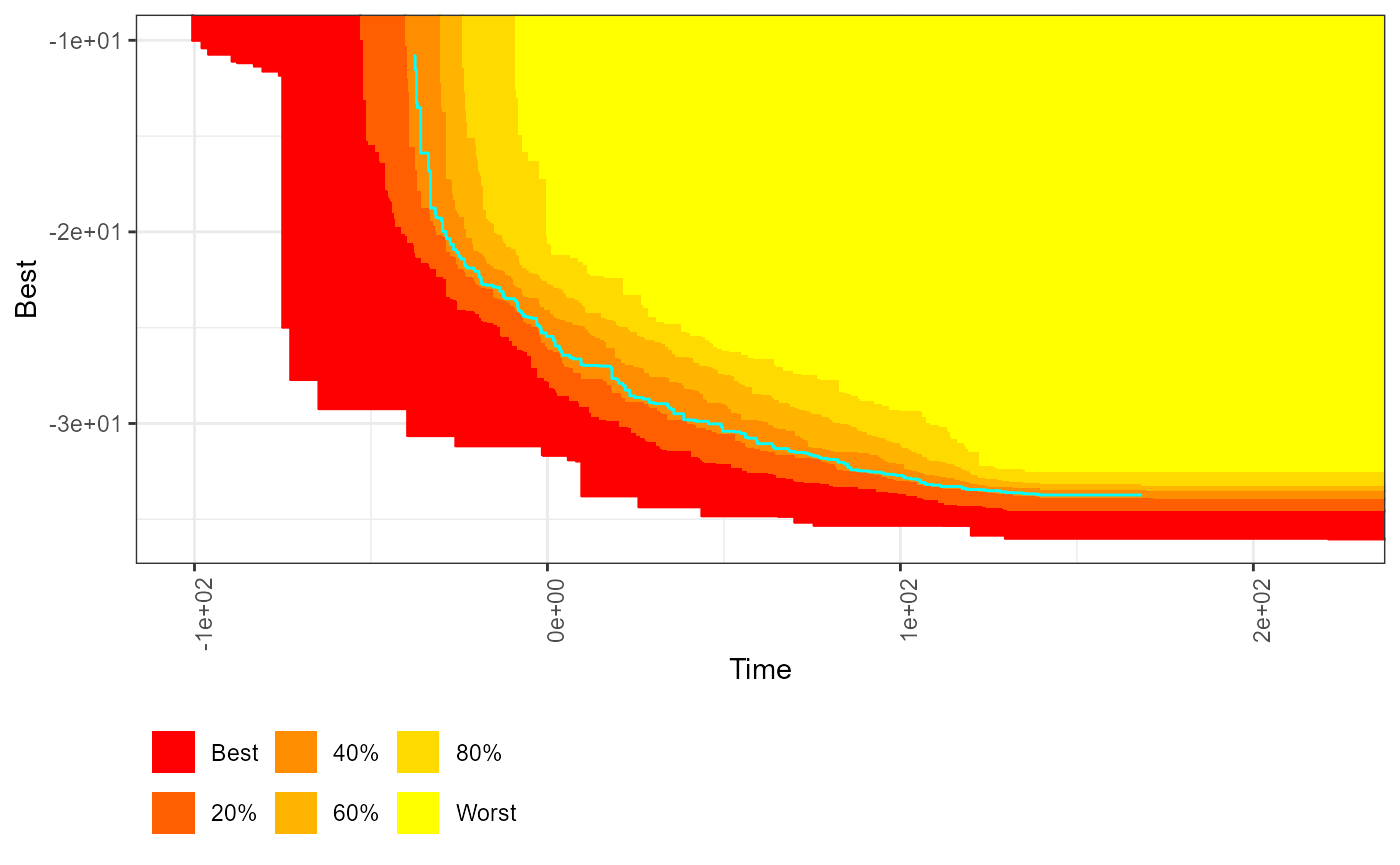
# interactiveeafplots' plotly
interactivesymdevplot(x=CPFs, threshold=res$threshold, col =c("red","yellow"),
                      percentiles = c(0,20,40,60,80,100), type="area",
                      thrcol="cyan", plot = "plotly", extraLegend="VE",
                      sci.notation = TRUE, legend.pos = "bottomleft")